Material presence note
Sensory Grounding Design: Using Texture to Spark Presence
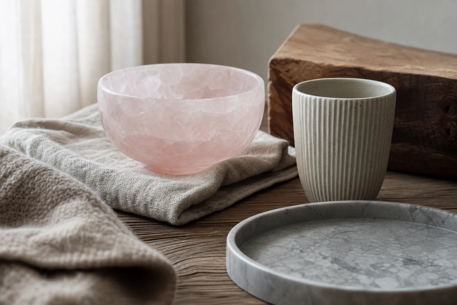
A rose quartz bowl on raw linen, a ribbed ceramic cup beside a smooth stone tray, a wool throw folded over polished wood: sensory grounding design begins with surfaces that ask to be noticed. The direct answer is simple. Layered tactile textures can make an interior feel more present when they create touchable contrast, not just visual decoration.
Somatic Sensory Textural Maximalism, as used here, is an editorial design phrase for rooms built with varied roughness, softness, density, grain, temperature, and hand-feel. It is design-focused rather than clinical. The useful claim is narrower: texture may invite sensory attention, slow down automatic looking, and make a room feel more physically inhabited.
broader context
Rose quartz context note
This narrower page makes more sense after the broader rose quartz context page.
What texture adds that color alone cannot
Color can set mood from across a room. Texture asks for closer attention. A pale pink rose quartz specimen may read as soft in color, but its surface can be cool, hard, waxy, polished, chipped, or uneven depending on the piece. That difference matters in tactile interiors because the body does not read a room only through sight.
Sensory grounding design works best when a room contains surfaces with different kinds of contact: dry against glossy, nubby against smooth, heavy against airy, raw against refined. A linen curtain, clay vessel, stone slab, woven basket, brushed wood shelf, and polished quartz object all carry different tactile signals. None has to dominate. The presence comes from relationship.
Tactile contrast is more useful than abundance. A room filled only with soft textiles may feel padded but vague. A room filled only with glass, stone, and metal may feel crisp but distant. Layered tactile textures give the hand and eye more to register: fabric drag, mineral edge, wood grain, unglazed ceramic, the give of wool.
That is the design argument. Texture can support felt presence in interiors as a subjective experience; it should not be framed as a reliable health-outcome tool.
How to build layered tactile textures without making noise
Raw tactile textures are strongest when they have places to rest. If every surface competes, the room becomes busy rather than embodied. A useful starting point is one calm base, one or two strong tactile contrasts, and a few smaller hand-level details.
Begin with the surfaces people actually meet. A chair arm, bedside table, entry tray, floor rug, cabinet pull, cup, lamp base, or stone object matters more than a texture placed only for a photograph. Physical tactile stimulation, in this design sense, is ordinary contact: fingertips on a ribbed vase, bare feet on woven fiber, a palm on cool stone, a shoulder against thick cloth. The room becomes more present because the materials are close enough to touch.
A balanced arrangement might pair polished rose quartz with rough linen, matte clay, and warm wood. Another might place a dense wool rug under a low table with a smooth stone bowl and a hammered metal dish. The point is not to collect every possible finish. The point is to let each material clarify the next one.
A small texture check
- Does the room include at least one soft, one hard, one matte, and one visibly irregular surface?
- Are the most tactile objects within reach, not only on a high shelf?
- Is there enough plain space around raw textures for them to register?
- Do the materials feel intentional together, or merely crowded?
- Can the room be described through touch as well as color?
If the answer is yes, the space is already doing the work. More texture is not always more presence.
Tactile deprivation in design, with limits
“Tactile deprivation” can be a useful phrase for interiors that feel visually finished but physically flat. A room may have coordinated color, clean silhouettes, and good lighting, yet offer little variation in hand-feel: sealed laminate, smooth painted walls, synthetic gloss, flat upholstery, and decorative objects that are rarely touched. In design language, that can feel thin.
The phrase needs restraint. It should not be used as a diagnosis, a sensory-processing claim, or a statement about what a person needs. Here it names only a design condition: too few touchable differences for the room to feel materially alive.
Layered tactile textures answer that condition by adding readable surfaces. Slubbed fabric, uneven stone, carved wood, unglazed clay, handwoven fiber, and visible mineral inclusions keep the eye from gliding too quickly. They make the room less like a rendered image and more like a place.
Rose quartz can sit within that language if it is treated as a material first. Its symbolic associations may matter to some readers, but the design effect comes from what can be observed: color, translucency, polish, fracture, mass, edge, and placement. Meaning can sit beside material reality; it should not replace it.
Where somatic sensory design gets misunderstood
Clinical overreach
The room is not doing clinical work. This page cannot make claims about predictable outcomes for health, distress, disability, or clinical sensory needs.
Maximalism as excess
Somatic Sensory Textural Maximalism can mean a quiet interior with a high range of tactile information, not a crowded room or trend wall.
Visual imitation
Printed texture may suggest materiality from a distance, but it does not offer the same hand-level contrast as actual stone, fiber, wood, ceramic, or metal.
A better reading is narrower and more useful: texture can shape attention. A rough bowl may make the hand pause. A dense rug may make the floor feel more noticeable. A cool mineral object may create contrast against warm wood. These are design observations, not treatment claims.
A single corner can hold tactile range: linen shade, stone base, paper surface, wool seat, clay cup, and a small rose quartz piece. The material range matters more than the number of objects.
Visual texture has a place. It should not be asked to do the whole job.
A small room test for felt presence
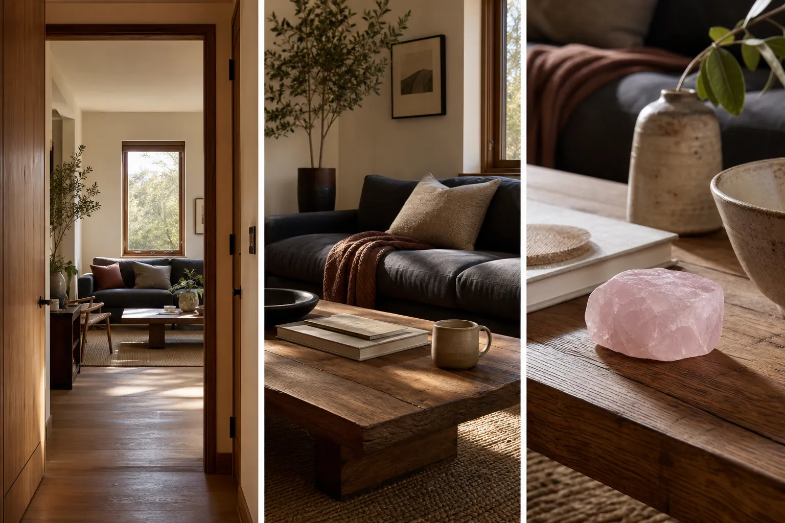
The most practical verification point is simple: describe the room without naming colors. If the description collapses, the design may be relying too heavily on visual palette. If the room can be described as cool, nubby, dry, dense, smooth, fibrous, matte, polished, grainy, heavy, or soft, it has a stronger tactile vocabulary.
Try the test at three distances
From the doorway
Texture should be visible enough to give the room depth: a woven rug, matte wall finish, rough vessel, folded textile, or mineral surface.
From a seat
Texture should sit within reach: fabric, table surface, cup, stone, book cloth, or wood grain.
At hand level
Texture should reward contact without demanding constant attention.
This matters in rooms that already use pale minerals, muted textiles, or soft symbolism. Rose quartz can become only a color cue if it is surrounded by equally smooth, equally delicate surfaces. Placing it near rough linen, dark wood, unglazed ceramic, or a weightier woven material gives the stone a clearer role. The pink becomes less decorative and more material.
The exception is personal comfort. Some people prefer very smooth, minimal, or low-contrast rooms. Others find heavy texture distracting. Sensory grounding design is not a rule every interior should follow; it is an option for readers who want more touchable presence.
Evidence boundary for this page
The supplied research material for this article did not include public authoritative references, curated firsthand reports, field tests, professional reviews, or verified terminology sources. That matters. The strongest claims here must stay within observable interior design reasoning and subjective design language.
So the page can say that tactile textures in interiors may invite attention, create contrast, and help a room feel more physically present to some occupants. It can discuss raw textures, layered surfaces, and material studies in interiors as relevant areas for future support. It cannot claim official terminology status, guaranteed emotional change, or professional therapeutic value.
If this page is expanded later, credible support should come from non-commercial design theory, environmental psychology, sensory processing research, occupational therapy literature, material studies, or accountable interiors practice. Retail descriptions, mood-board language, affiliate decor guides, and short social posts may help identify vocabulary or misconceptions, but they should not carry the factual weight.
That boundary does not make the design question empty. It keeps the answer tied to material reality.
The bounded answer
Sensory grounding design uses texture to spark presence by giving the body and eye more material differences to notice. The strongest version is not a cluttered pile of objects; it is a layered set of tactile relationships: rough beside smooth, soft beside hard, dense beside light, raw beside polished.
For a rose quartz interior, that might mean letting the stone stay visibly mineral rather than turning it into promise language. Place it where its coolness, polish, translucency, and weight can meet linen, clay, wood, wool, or metal. The result may feel more embodied because the room offers more to sense.
That is as far as the evidence here should go. Somatic sensory design can be a careful language for lived aesthetic use, tactile attention, and felt presence in interiors. It should remain subjective, material, and bounded.